
Sage Bottoms
- Client
- Sage Bottoms
- Year
- 2022
- Discipline
- Logo Design, Branding
- Status
- Shipped
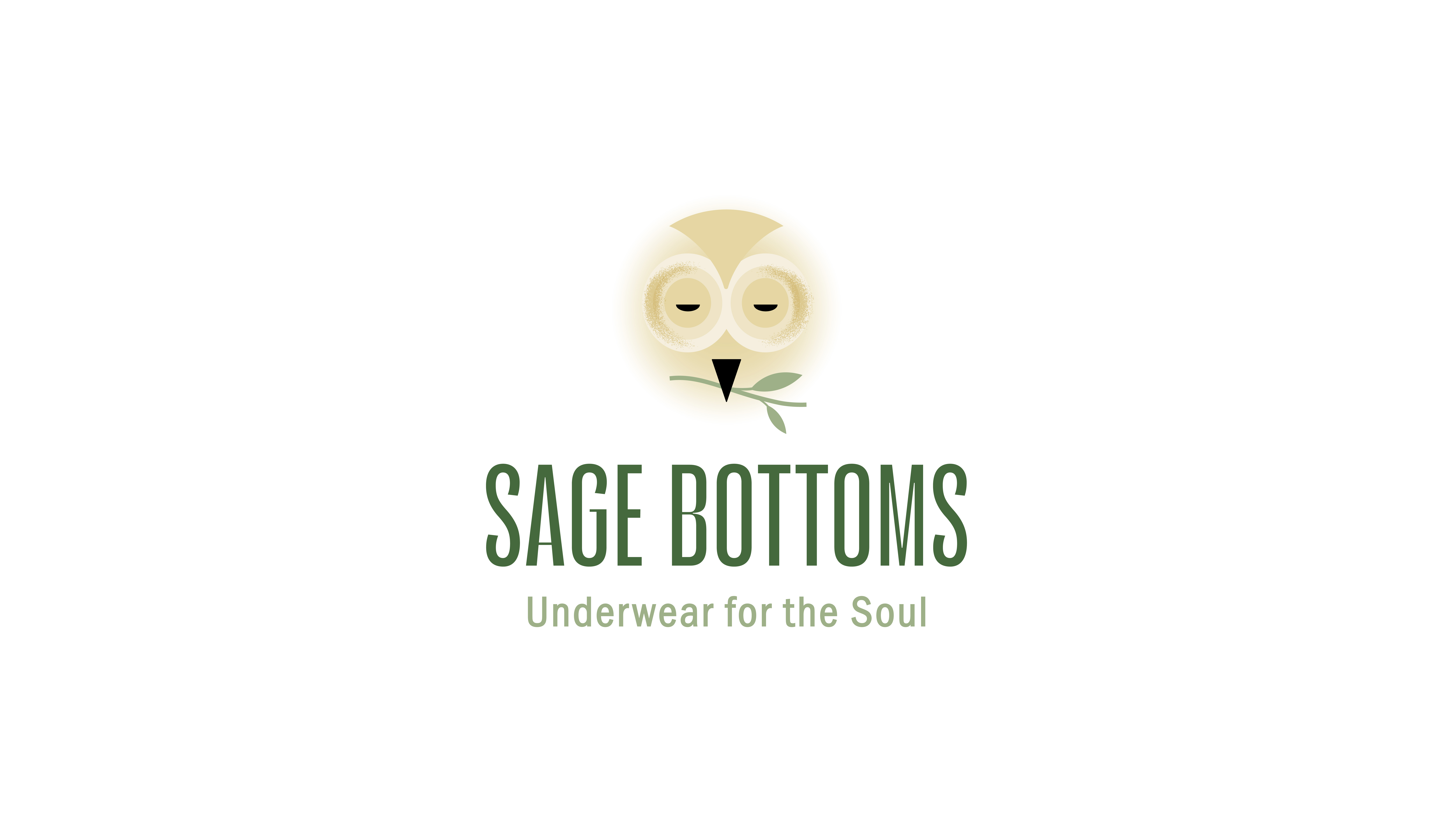
The goal was to create a logo for Sage Bottoms that felt intimate, approachable, and distinctive within a competitive market.
The mark needed to work across print, digital, packaging, and social media while remaining clear and recognizable at different sizes.
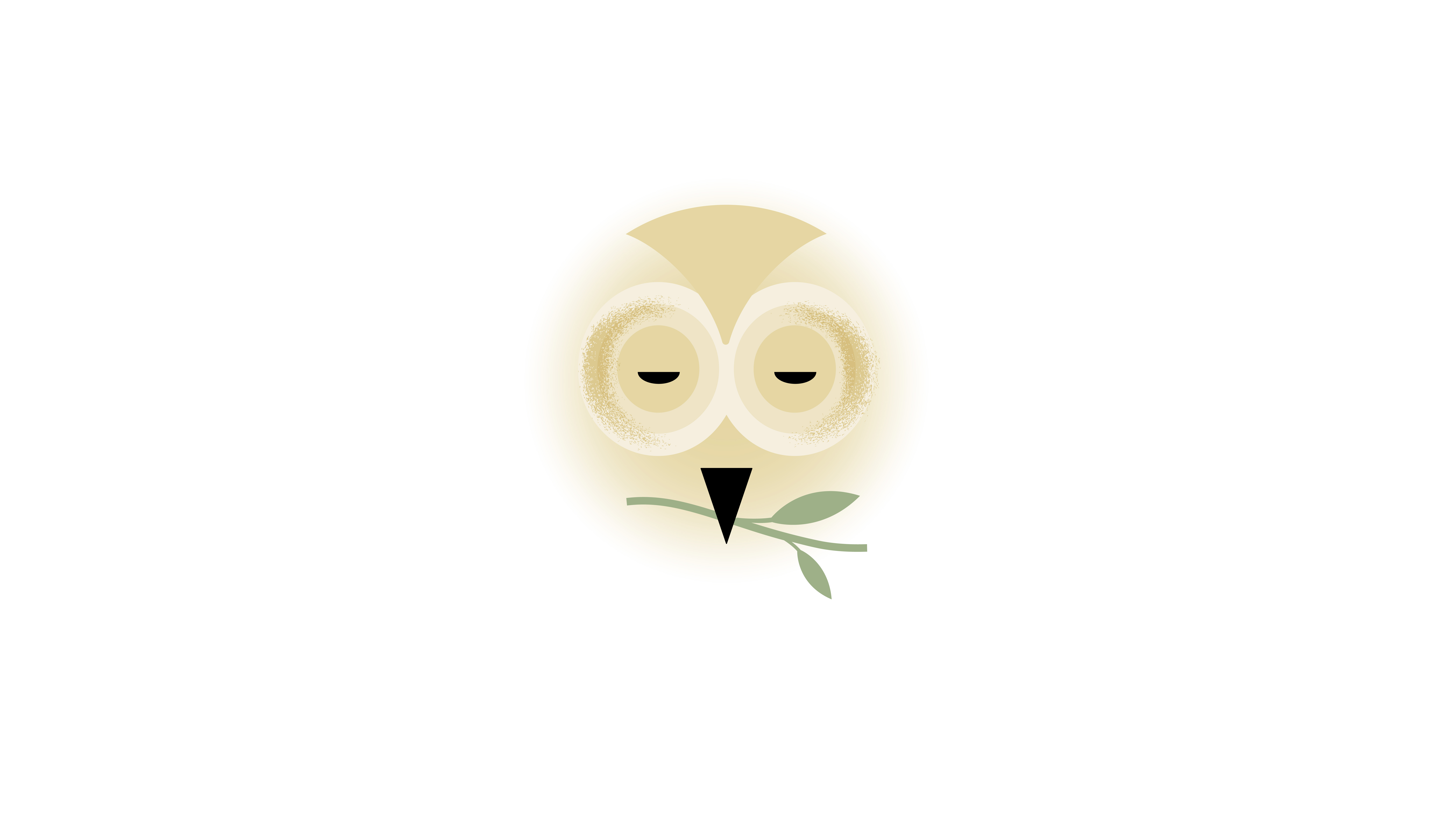

We explored the visual language around the Sage Bottoms name and developed a mark with a soft, natural character.
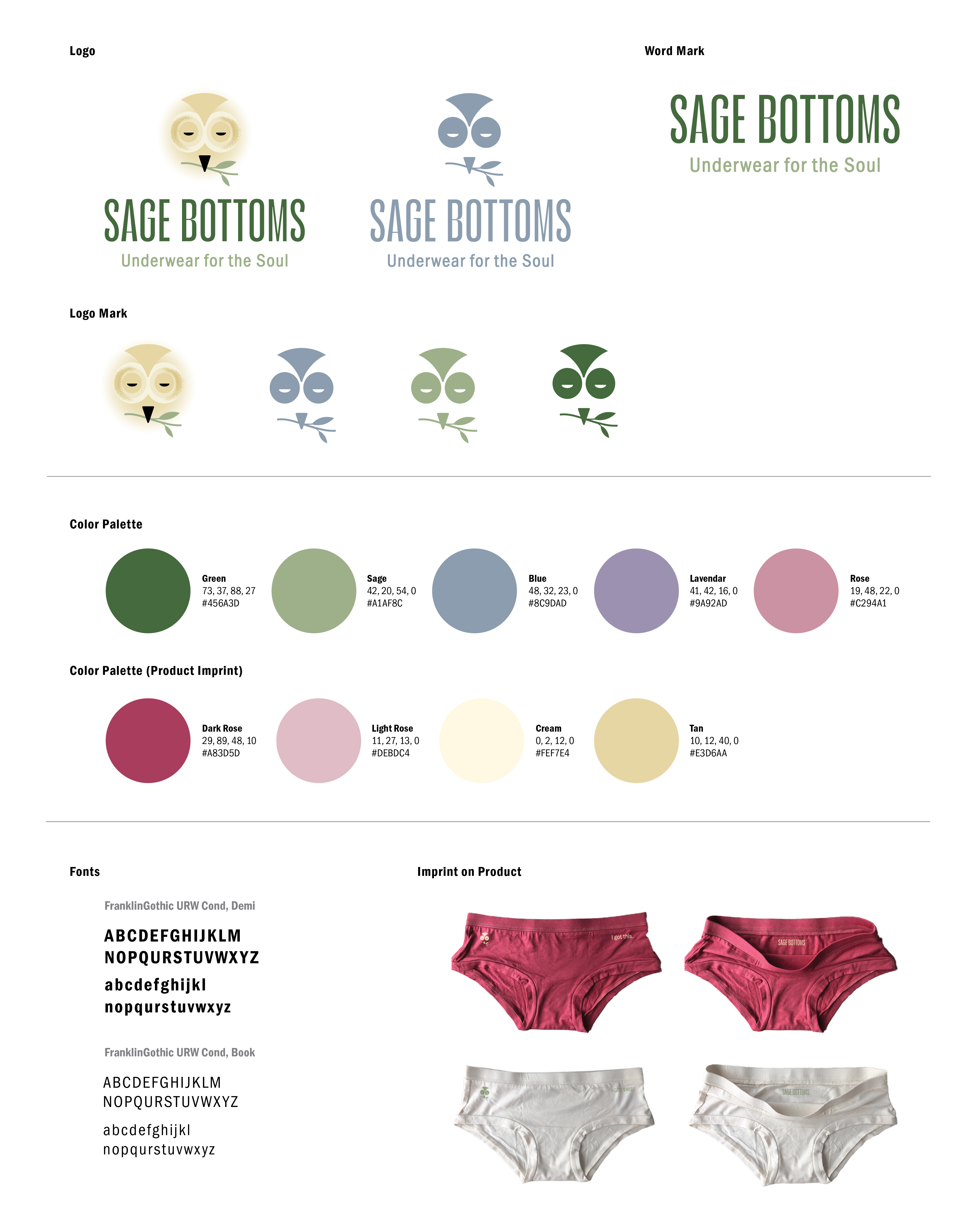
Typography and color were chosen to support the brand's personality while giving the identity enough flexibility to work across different applications.
A soft, natural mark that feels approachable and credible—equally at home on a small label or across a digital screen.
The supporting identity carries that visual language across packaging and social, giving Sage Bottoms a cohesive presence across the brand.