
Better Than Book Club + JOYful Purpose
- Client
- Rebecca Woods
- Year
- 2024
- Discipline
- Naming, Logo Design, Branding
- Status
- Shipped
The challenge was to create two distinct identities for Rebecca Woods’ businesses while maintaining a visual connection between them.
Better Than Book Club needed to feel joyful, inviting, and community-focused for women 30–55 discovering home décor through a subscription box.
JOYful Purpose needed to communicate comfort, safety, and joy for seniors transitioning to assisted living.


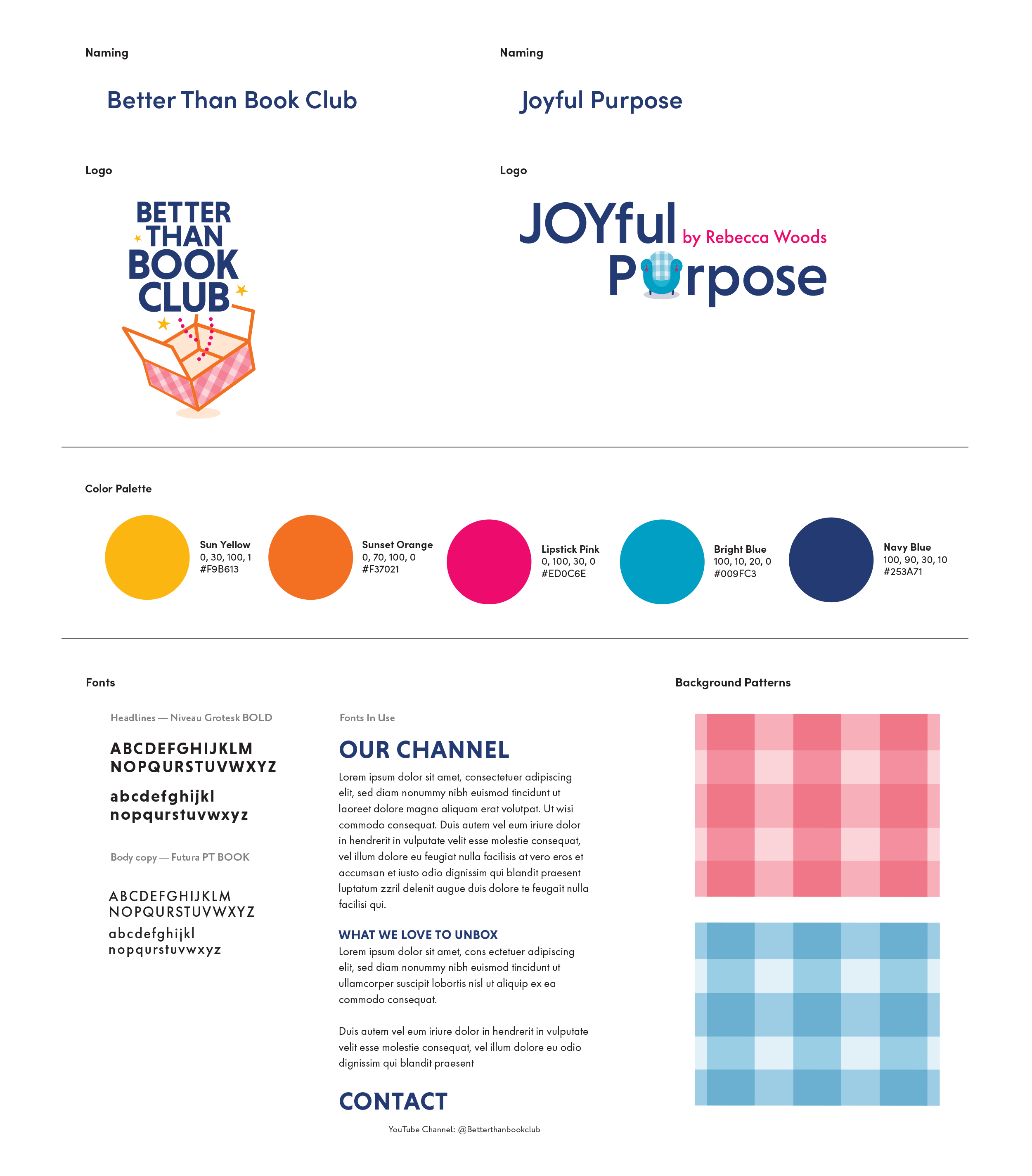
We developed two identities with their own personalities, using a shared palette and complementary patterns to connect them.
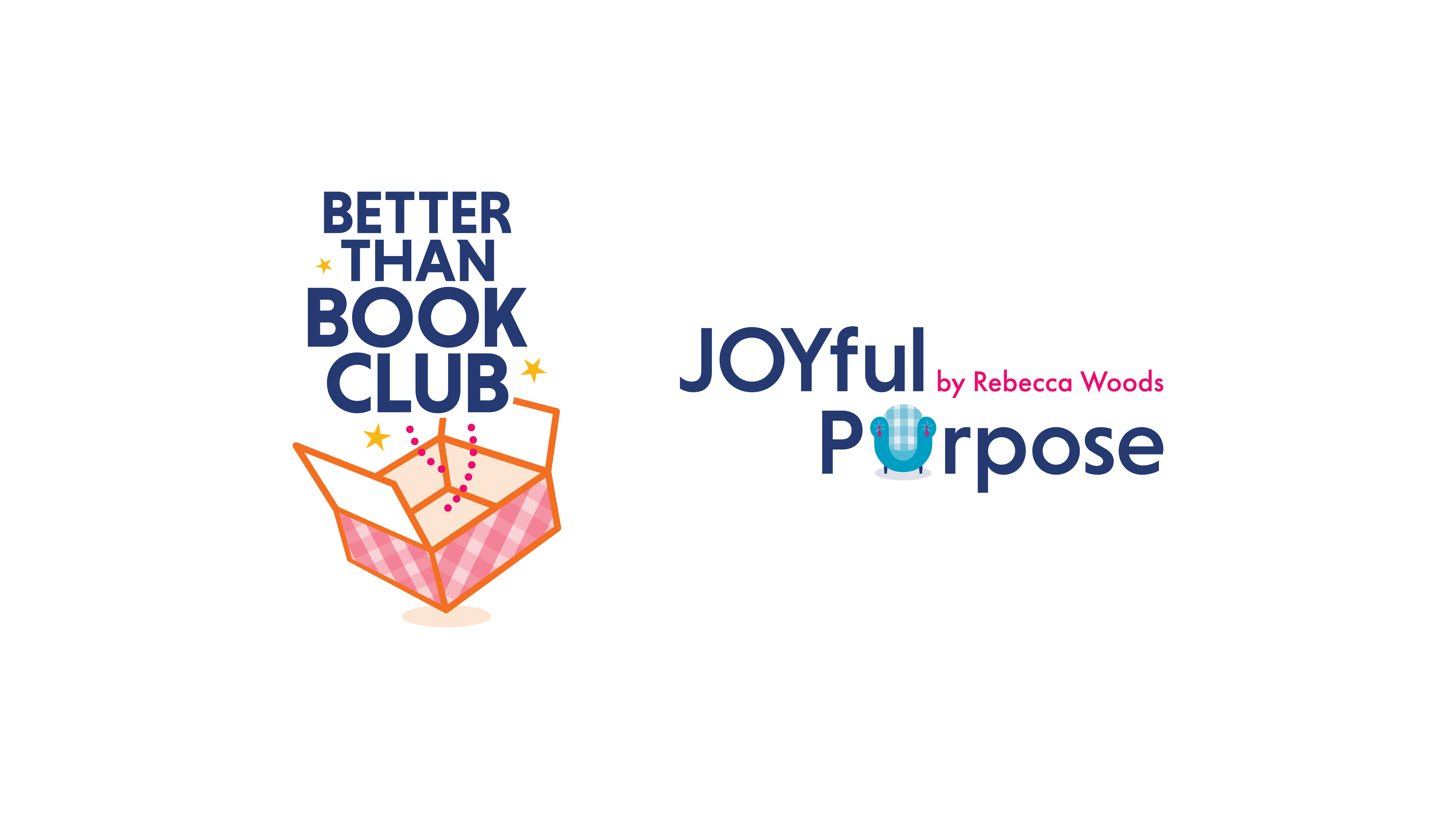
The result: two marks that stand on their own while working together as a cohesive visual family.
Two related identities, each designed for its own audience and purpose, but connected through a shared visual language.
The system gives Rebecca the flexibility to build both businesses independently while still creating a clear connection between them.